Cedarcrest Health Mobile App
Cedarcrest Health Mobile App

The Product
A mobile app to help a hospital take note of patient check-in and fill out additional medical forms.
Project Duration
Two Weeks
Overview
Problem:
Patients at family doctors’ offices need a faster, clearer, and more accessible way to check in and complete health screening forms because current paper-based systems are repetitive, confusing, and not designed for accessibility.
Goal:
The goal of this project is to design and evaluate a hospital check-in app that improves efficiency, accessibility, and clarity in the check-in and health screening process.
User Research
Summary:
Most doctor’s offices still rely on paper check-ins. These systems are slow, repetitive, and not designed with accessibility in mind. Parents end up writing the same info for every child, every visit. Patients with vision impairments or other disabilities often need assistance, which takes away independence. Even people who are familiar with the process get stuck in confusing flows where they’re not sure if they actually finished checking in.
Competitors like Jotform or Salesforce Health Cloud show that digital systems are possible, but they either try to do everything at once (overwhelming) or are too simple and disconnected from the actual appointment process. There’s a gap for something focused, patient-first, and easy to use.
Pain Points
Repetition
Patients have to write out the same information every visit. Parents with multiple children end up re-writing even more.
Errors in Writing
Handwritten information can be hard to read, leading to mistakes when hospital staff has to enter it into the system. Patients might also skip steps, or forget information by accident.
Storage
Hospital clinics have to store the multiple stacks of paper, making it harder to track past forms.
Inclusion
Non-English speakers may face barriers filling out the forms. Patients with low-vision or difficulties with reading may require assistance from staff or family members to fill forms.

Personas


User Journey Map
I created this user journey map to help visualize the current process of filling forms at the hospital. It made it easier to understand a patient’s experience, and identify where they may encounter certain pain points, and helped me to identify what features I want to include in the app design.
Starting the Design
Paper Wireframes
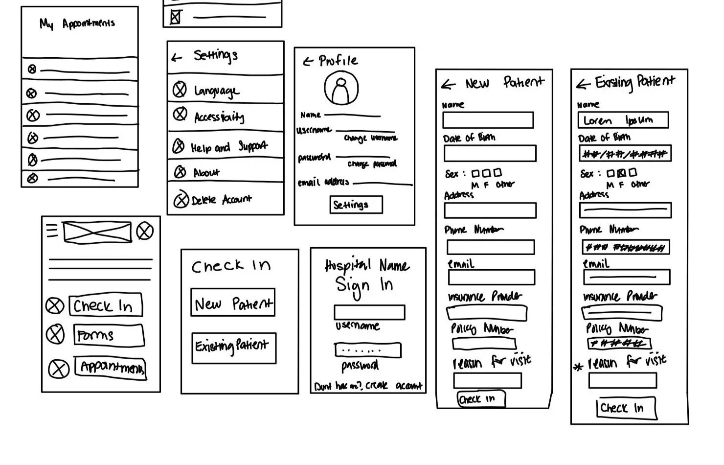
I sketched paper wireframes that incorporated some of the pain points I collected. I made sure to consolidate the appointments, have the forms and appointment information all be in one place. I sketched multiple variations to keep the app simple, accessible, and directly aligned with patient needs.
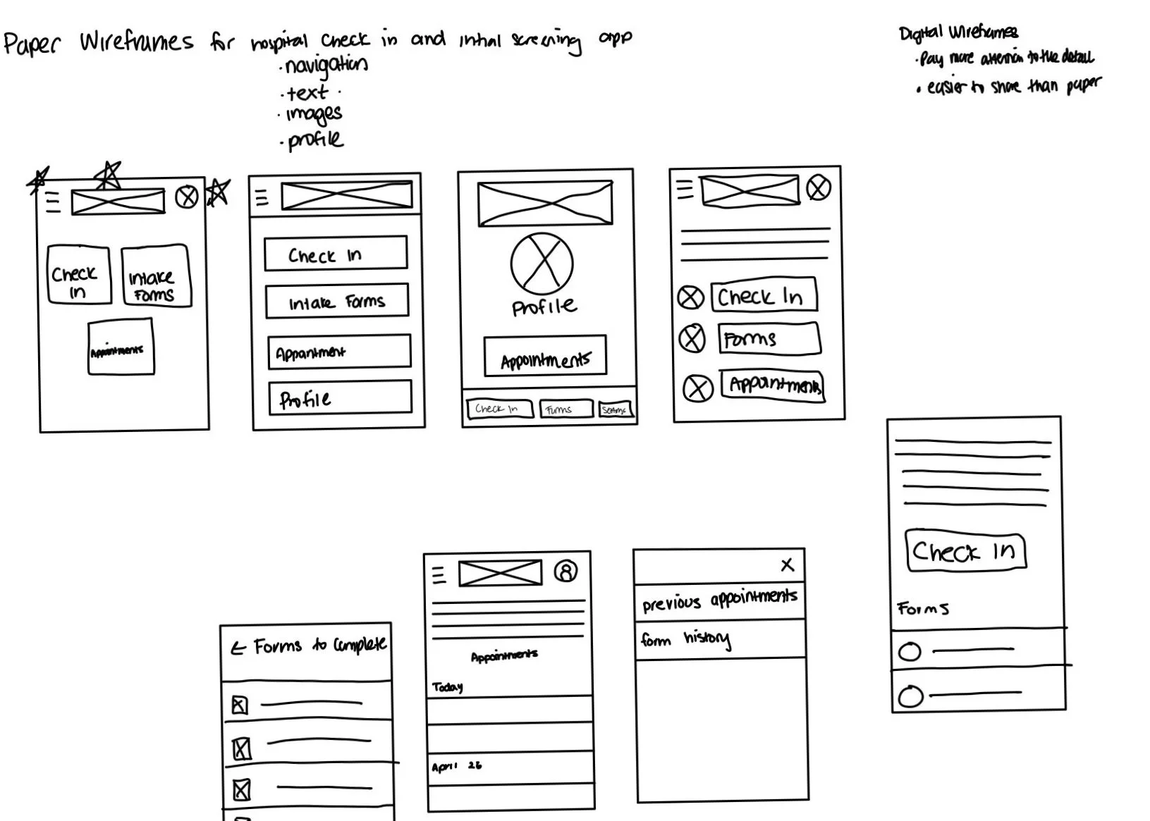
Digital Wireframes
I refined the paper wireframes through my digital wireframes, and added more details, and figured out what places I wanted things to go in. I also gained a better sense of the spacing on the phone and adjusted some of the sizes of buttons and text fields accordingly.
Usability Study Findings
Check In Flow
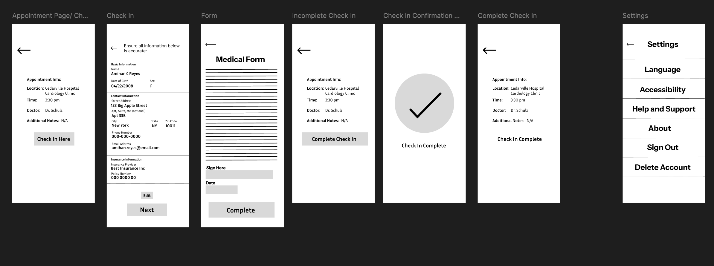
In the tests, participants were often confused about whether forms were part of check-in or separate. I decided to combine these steps into a single guided flow with progress indicators. This way, users can clearly see where they are in the process and what’s left to complete
Profile vs. Appointment Info
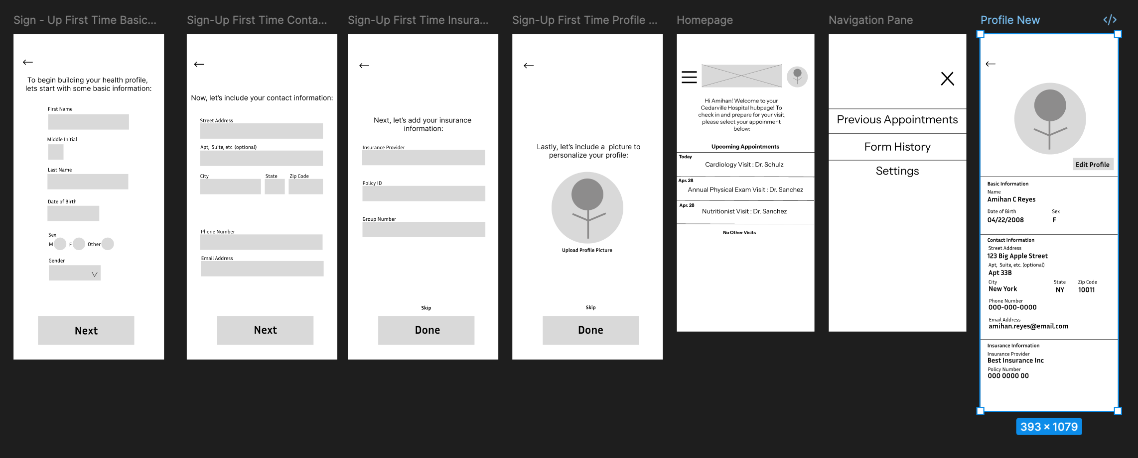
Several participants expected to edit personal details like date of birth directly in their profile, not in the check-in forms. I decided to separate “Profile Information” (permanent details like DOB, contact info, password) from “Appointment Check-In” (temporary forms, updates)
Confirmation Screens
A big takeaway from the usability study was that users weren’t sure if they had actually finished checking in. To address this, I added a confirmation page at the end of the flow that reassures patients their information was submitted successfully
Accessibility Considerations
One participant with vision challenges highlighted that icons alone weren’t always clear. I made sure to pair text with icons and made sure navigation used both visual and written cues to support accessibility
Mockups
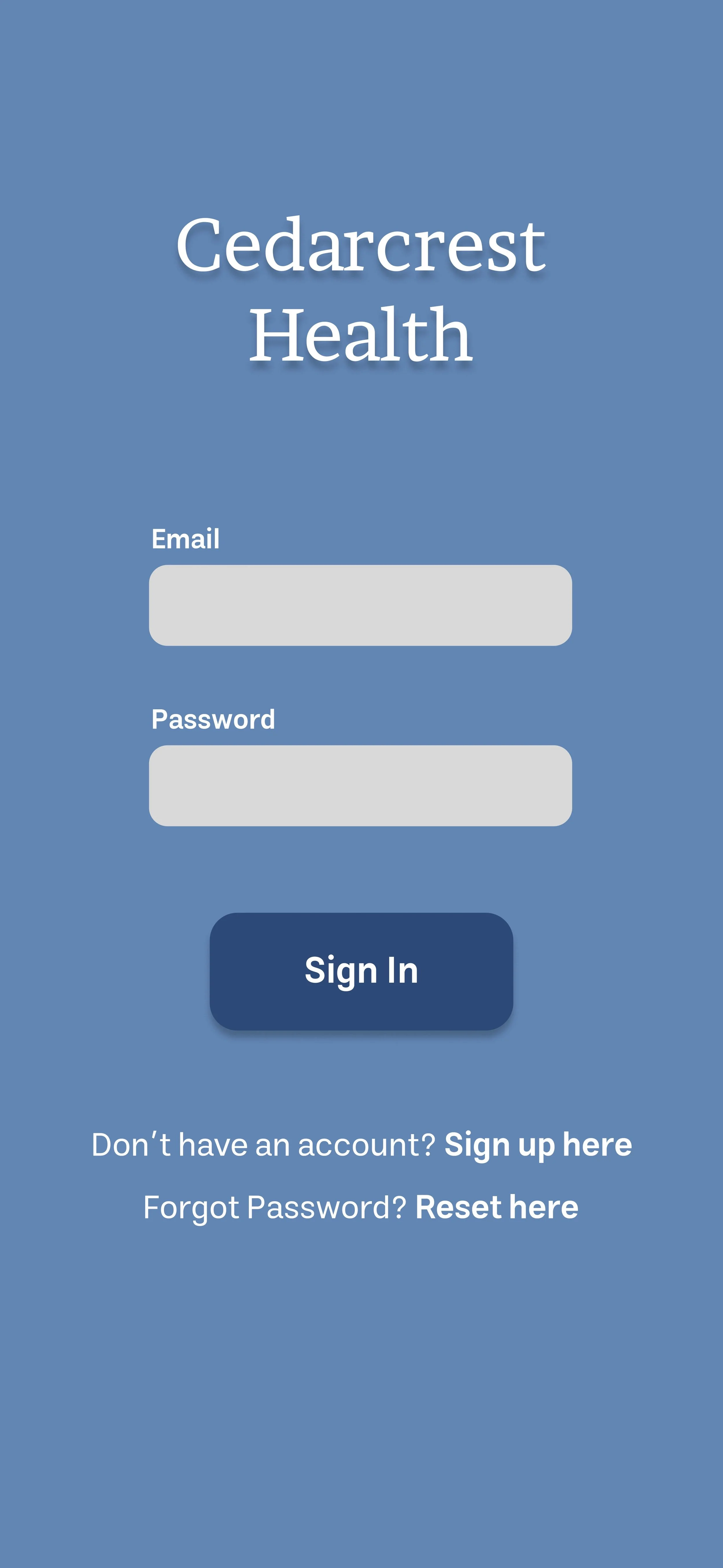
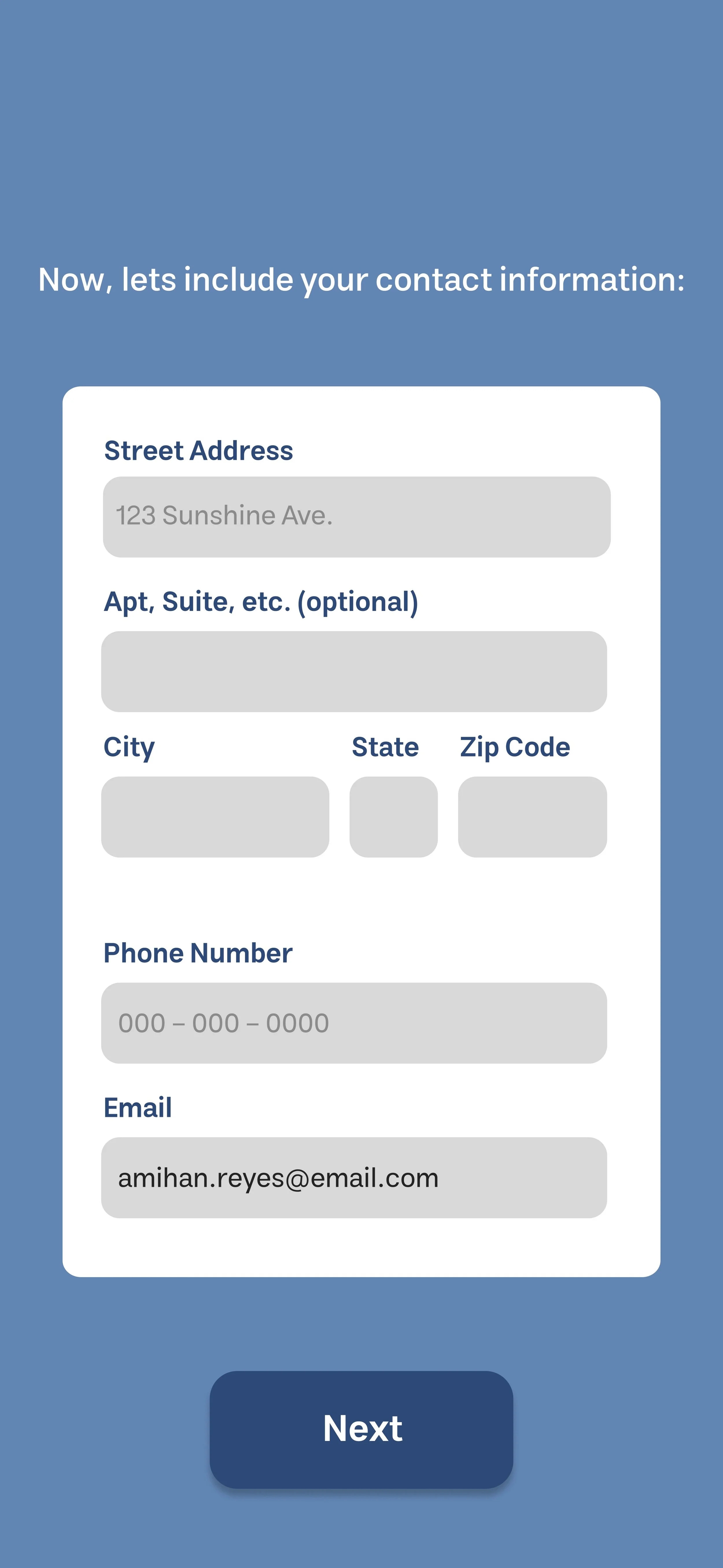
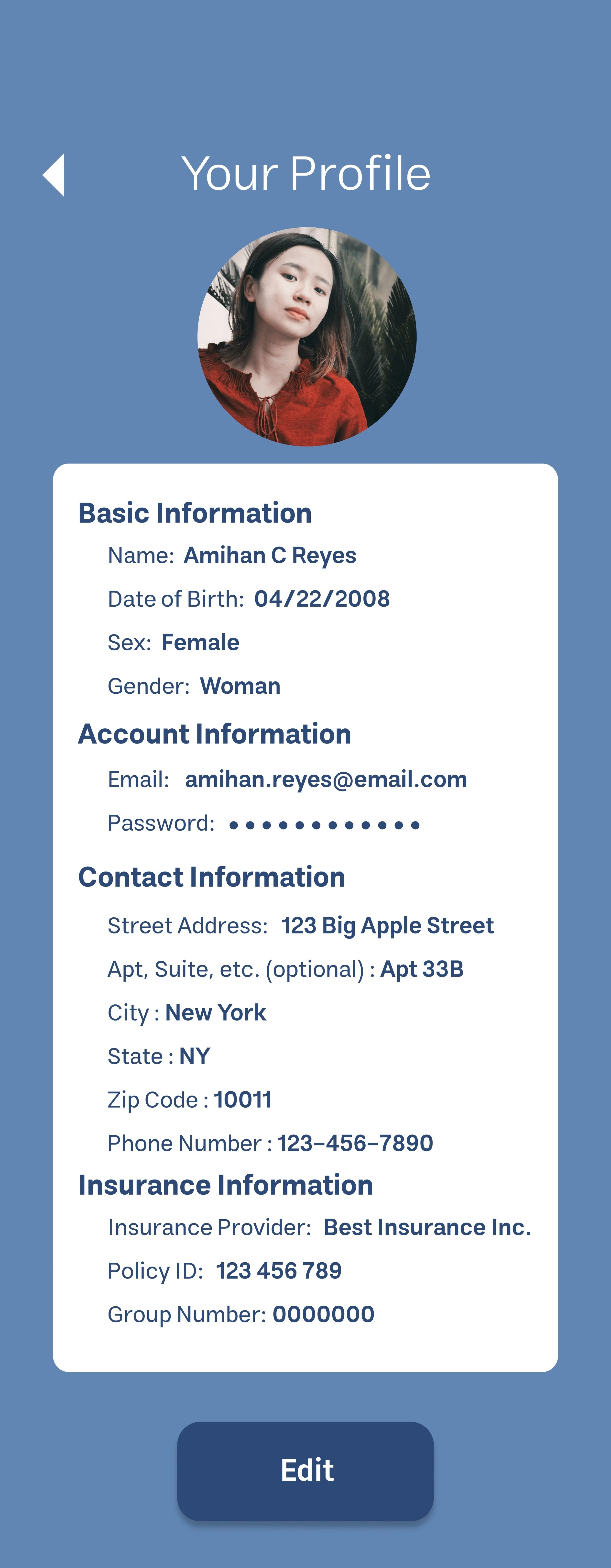
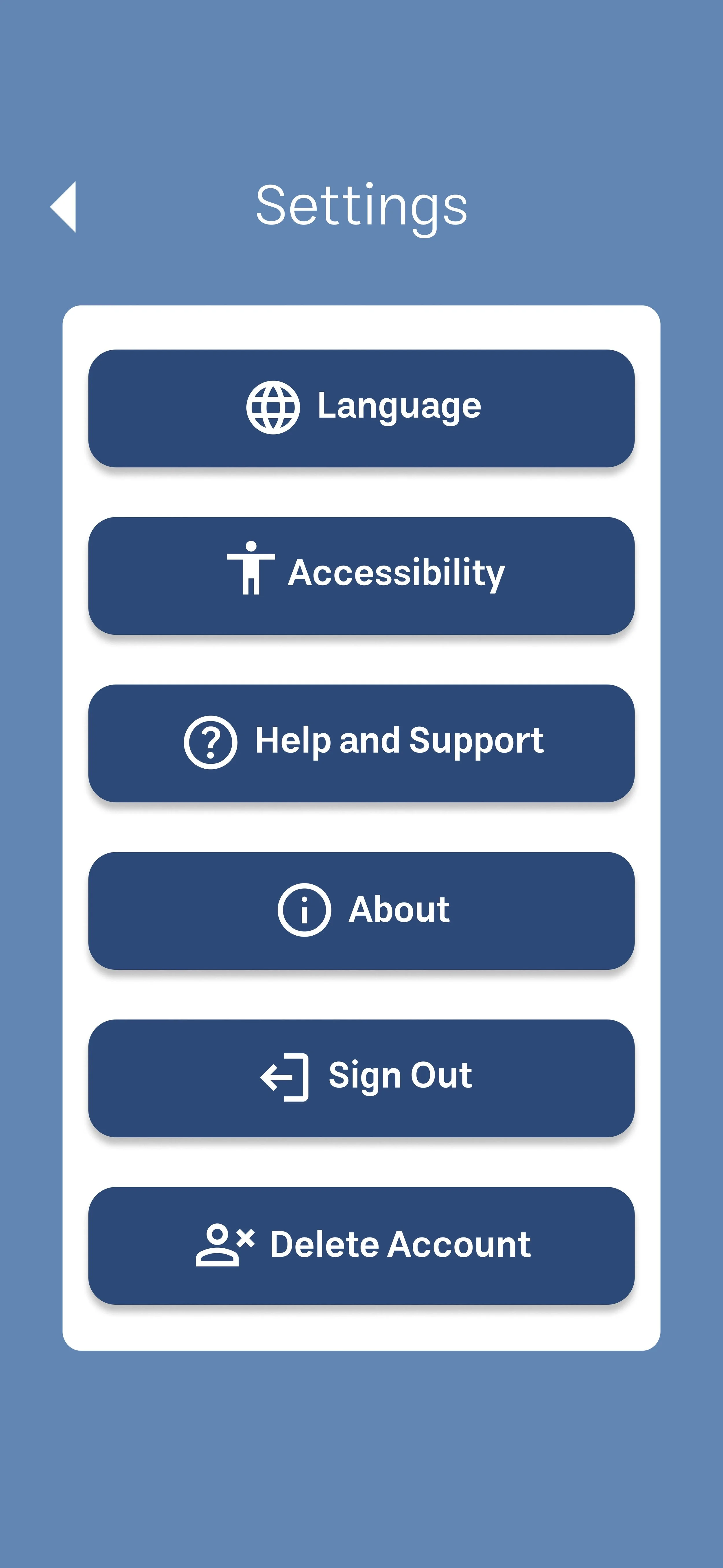
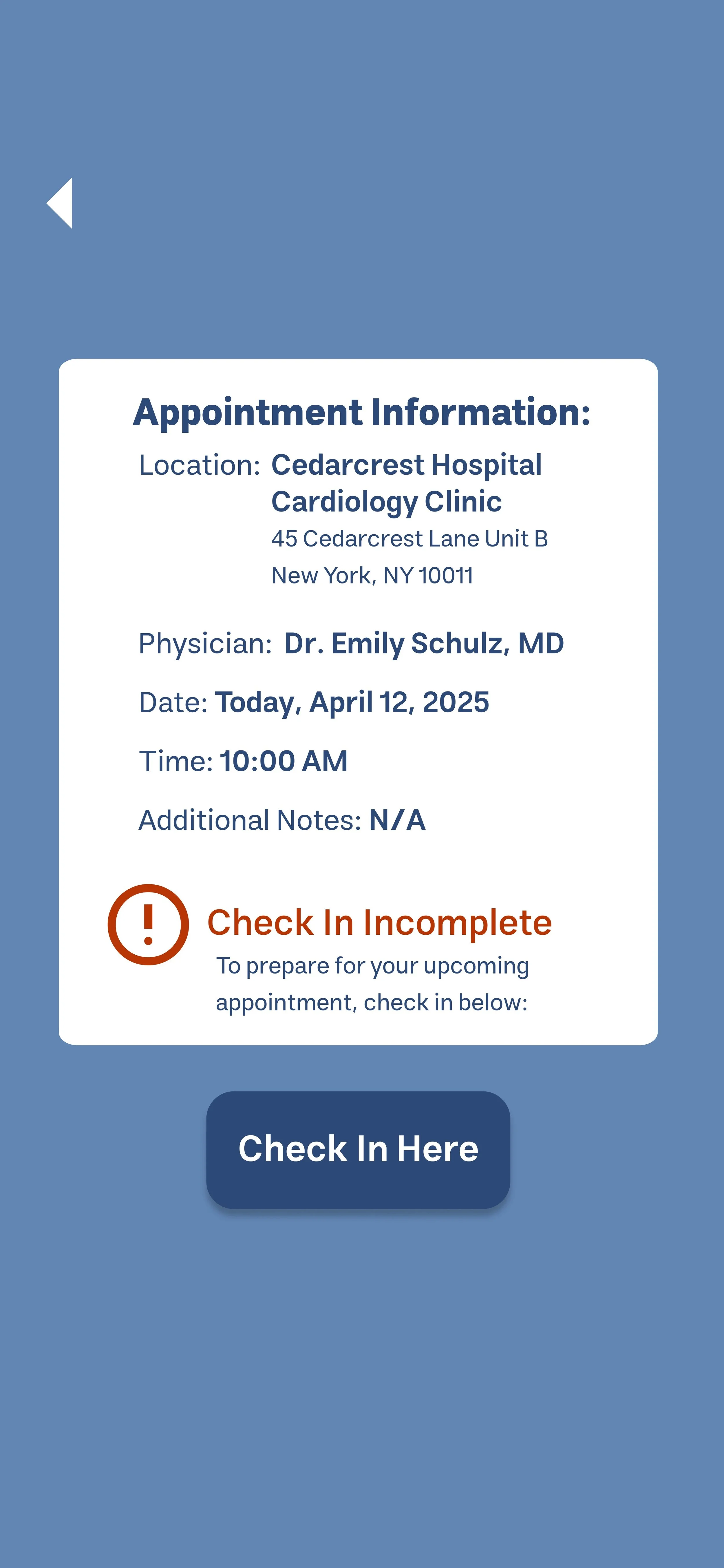
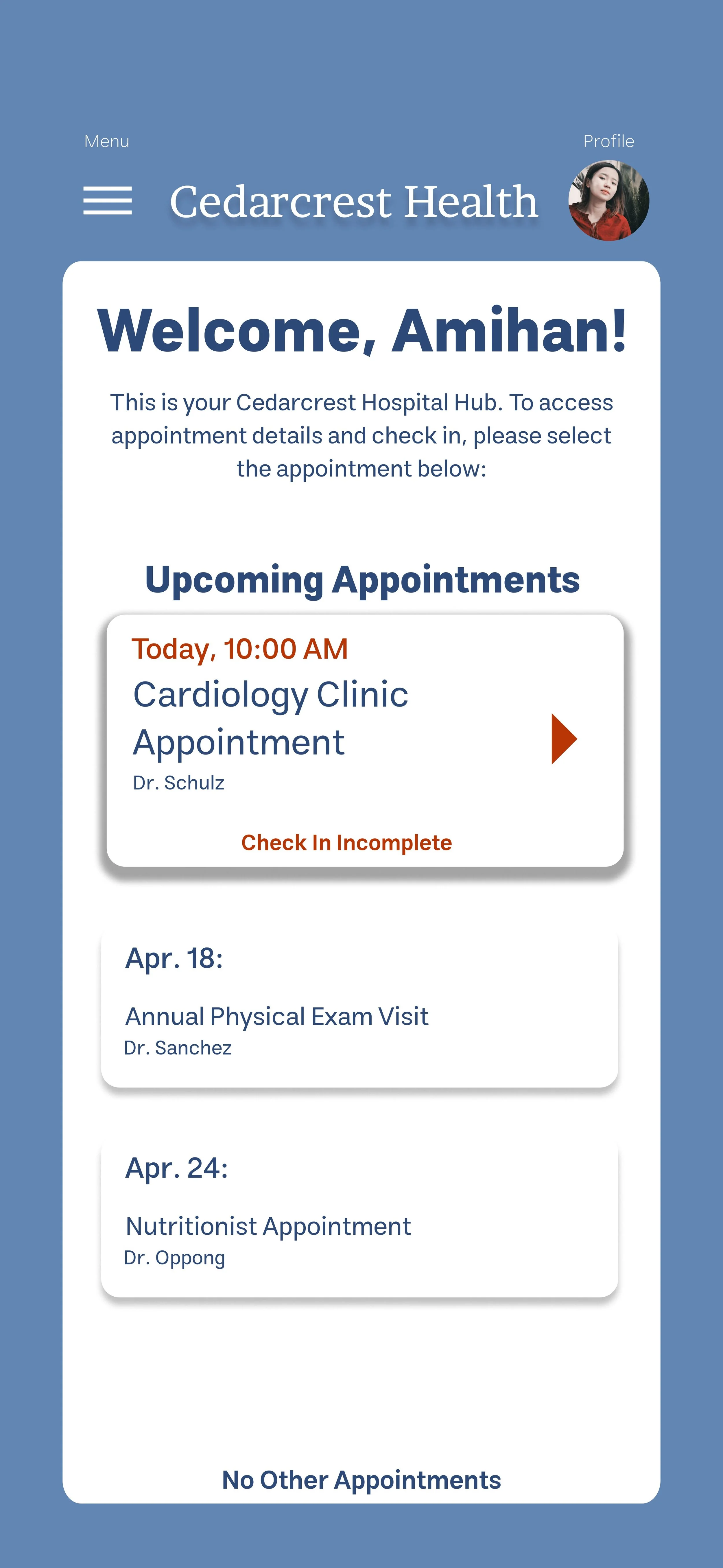
For the high-fidelity mock-ups, I decided to go with blue to invoke a calming aura within the application. I wanted to also ensure that there were labels and clear icons to make navigation clear for the user. I made buttons that signified clear actions bold, and also tried to make sure that check-in information was clear, and consolidated under each appointment so that users did not have to figure out where to make those changes. I also made the profile section more thorough, and made it so that patients could edit basic information in a centralized place. I also included confirmation pages and changed colors from red to green when check in was complete to ensure patients knew they were done signing in.
Accessibility Considerations
Site Map
Consolidated check-in tasks under each appointment to help guide navigation for users and make process easier to complete.
Navigation Labeling
Paired icons with with text labels, so users relying on screen readers or those unfamiliar with icons could navigate easily.
Next Steps
Impact: Patients will be able to check in faster and with less stress, less form filling repetition, and clinics will benefit from fewer errors in patient data reducing staff work and increasing efficiency.
Key Takeaways: Usability tests are really important in refining design. The insights I got from the usability testing made my design much more user-friendly and user-centered. I was able to iterate on my designs and make them fit the user needs better and overall help make the check in process easier.